
brand essence
Pretty Please isn’t just a brand. It’s a feeling you thought you forgot—until a jacket, a necklace, a scribbled sticker brought it screaming back.

Our Philosophy
Our Mission:
We’re here to bring back the magic of your most meaningful memories. Every piece we create is a small reminder of a time when life felt simple and every moment was full of wonder.
Our Vision:
We want to be a brand that makes you feel at home—connecting you to the past while celebrating the beauty of life right now.
Core Values
Genuine Connection:
We value real stories and moments of pure joy.
Attention to Detail:
Every design is crafted with care.
Warmth & Nostalgia:
We honor the quiet moments that have shaped who we are.
Modern Touch with a Nod to the Past:
Our style combines everyday comfort with hints of vintage charm.

who we are
*
who we are *
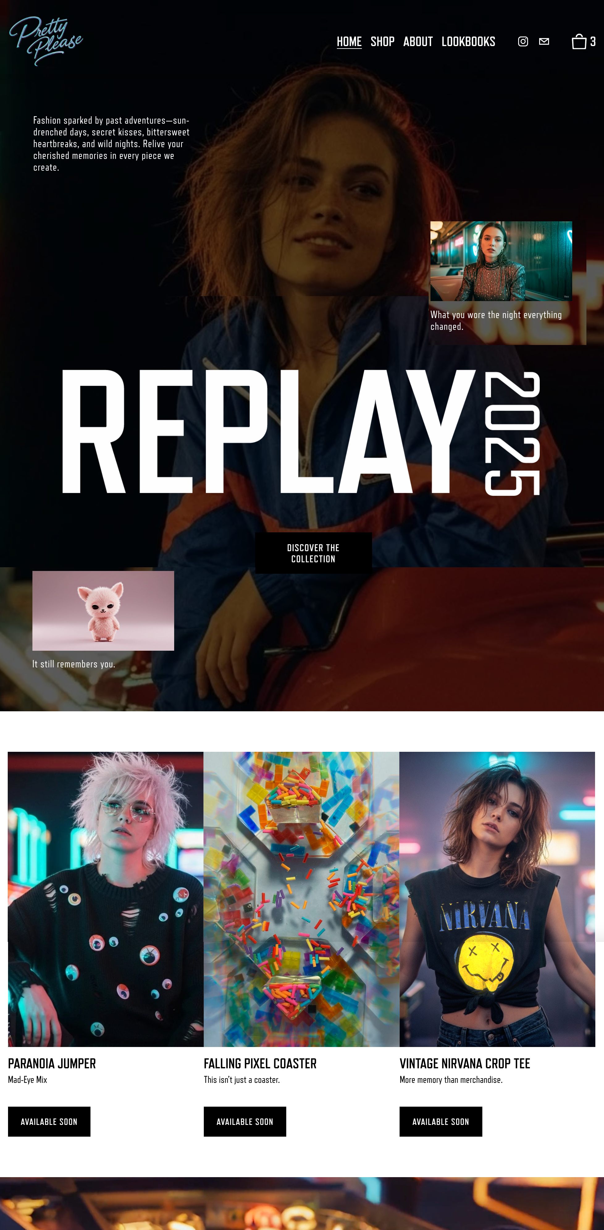
Our Look
We’re dreamers and doers who remember the magic of our youth and want to pass that feeling on to you. Our heart lies in creating garments and accessories that bring a smile, invite you to slow down, and celebrate the little wonders of life.
The Logo:
Our logo isn’t just a design—it’s a symbol of the shared memories and journey we experience together. It remains simple, timeless, and full of heart.
How to Use It:
Keep plenty of space around it to let it breathe. Use our full-color version on lighter backgrounds; on darker ones, opt for the refined monochrome style.

our colors
Our color palette captures the gentle hues of memories past:
Twilight Black
#000000
The calm of a quiet evening
Moonlit Ivory
#F6F1E9
Soft light that warms the heart
Velvet Violet
#F4E0FF
The sweetness of a summer sunset
Ocean Teal
#449B94
Moody, mysterious, a little toxic
Second Smoke
#008080
Cool, close and almost not real

Our Fonts
Headlines:
Bold and expressive, like stories told on classic storefronts (think Refrigerator Deluxe Bold or a vintage-inspired display font).
Body Text:
Clean and easy to read—like a handwritten note that speaks from the heart (for example, Roboto or Refrigerator Deluxe Regular ).
Our imagery

Our photos capture real moments—warm smiles, quiet corners, and everyday beauty:
Style:
Natural light, genuine expressions, and scenes that feel welcoming.
Themes:
Urban streets bathed in soft light, joyful gatherings, and the small details that make each moment special.
our voice
Friendly & Sincere:
Our words invite you in and make you feel right at home.
Honest & Reflective:
We share real moments and simple stories that resonate with you.
Calm & Confident:
Our tone is genuine and relaxed, celebrating what truly matters.
Bringing Memories to Life
Online Experience
Our website is designed to be your own gallery of memories:
Interactive Stories:
Please scroll through our digital lookbook and be swept away by evocative images and personal stories.
Social Moments:
Connect with us on social media and share the memories that have shaped you.
print & packaging


Card Game
Sticker Sheet
Usage Guidelines & Examples
-
Consistent Layouts:
All collateral should have a uniform grid structure, whether digital or print, to maintain brand balance.
-
Example Digital Ad Layout:
Include a large, high-quality image background, minimal text overlaid in the primary typeface, and clear CTA buttons in Black or White.
-
Example Printed Invitation:
Use a soft blush background with the logo embossed in Midnight Black or pastel purple and elegant typography.
Additional Resources
A repository of logos, images, and design templates is maintained for all stakeholders. Request access via the brand management portal.
For queries or custom assets, please contact us.